
I don't like this year's default theme. I was excited for a few months looking at the previews and news circulating around, but it ended up not meeting my expectations.
WordPress provides a new default theme every year which strives to bring out the most important blogging principles and features as possible. With the arrival of WordPress 4.1, they bring along Twenty Fifteen, the replacement of the last theme Twenty Fourteen.
I really wanted a theme that could flesh my content in a easily readable and presentable way. These are the problems I are stopping me switching to Twenty Fifteen:
Everything is big
The font is a lot bigger than Twenty Fourteen but amazing still fits everything Twenty Fourteen did. It feels if I'm just trying to make content for the sake of it, like when you write a report and waffle on and on to pad the word count.
Mobile theme
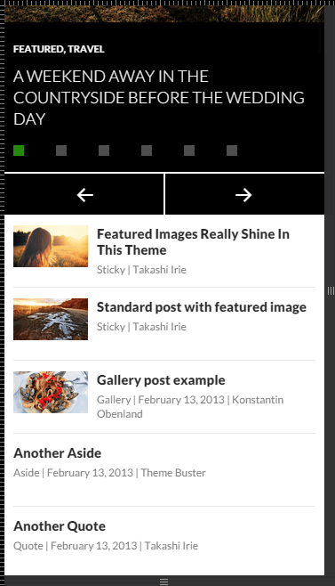
When on your mobile, the Twenty Fourteen theme nicely compacted your posts into a list, only showing their title, date and author.
Viewing Twenty Fourteen on a Galaxy S4:
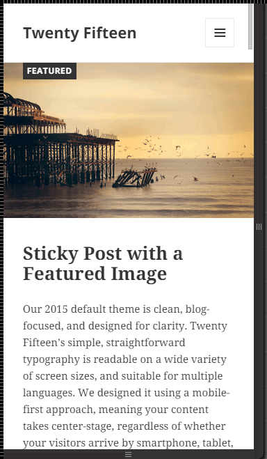
On the Twenty Fifteen theme, the entire post is shown as if you're on a desktop.
Viewing the Twenty Fifteen on a Galaxy S4 - the entire opening of the post is shown.:
Now if I'm on a mobile, I'd prefer the most compact and easily navigable layout as possible - which Twenty Fourteen does better than Twenty Fifteen. On a tablet this looks okay but not on mobiles.
Existing Featured Images from Twenty Fourteen don't stretch
This is a bit annoying, creating a lump of white space on either side of the image

This is really ugly when you look at it, like I didn't put any effort into creating and editing my pictures. Some pictures are small I know but at least they should automagically stretch.