Some small tweaks here and there.
I was thinking this site was a bit ugly and it was mostly to do with the font and spacing. I created this theme myself and I'm definitely no design pro...but I can be at times.
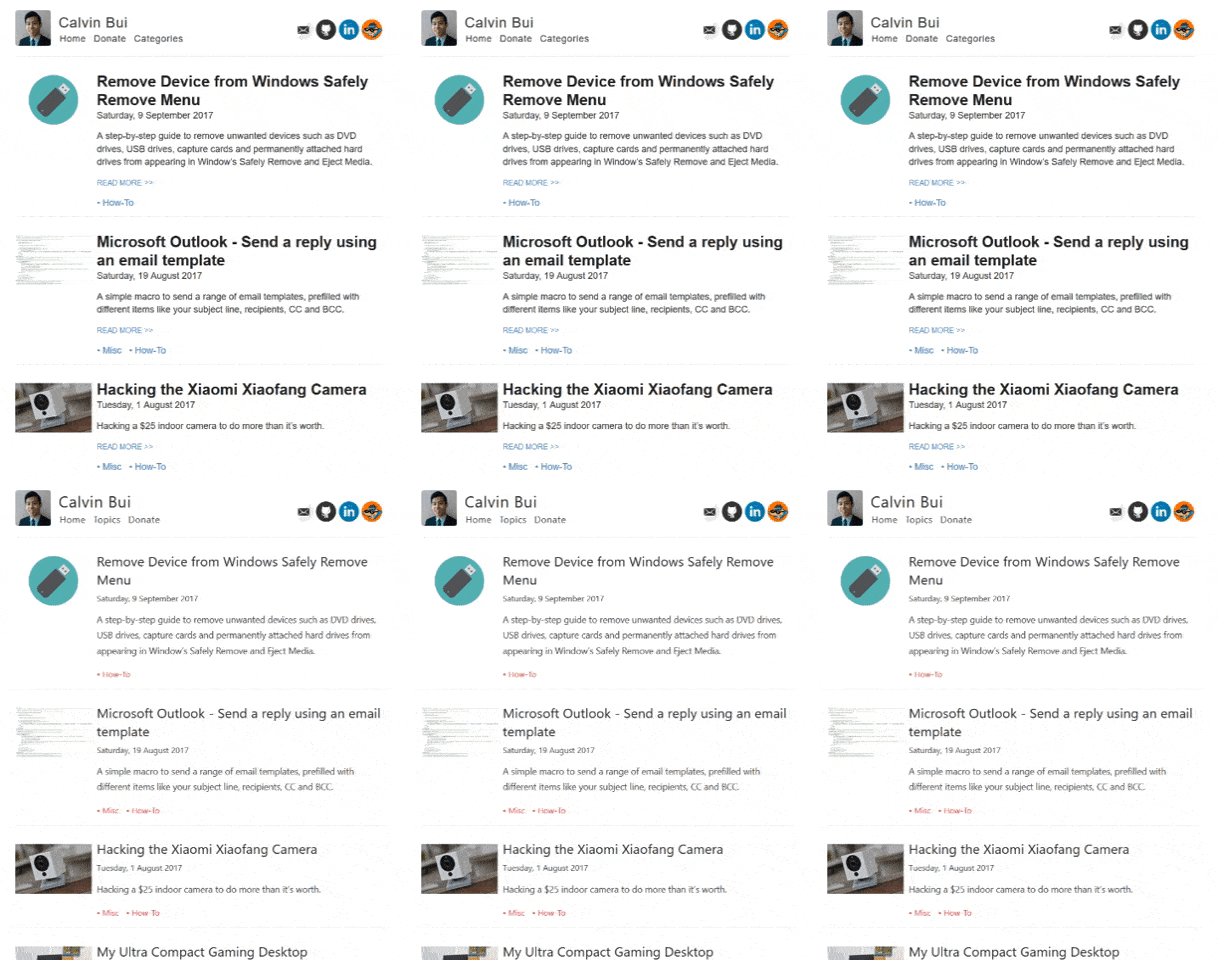
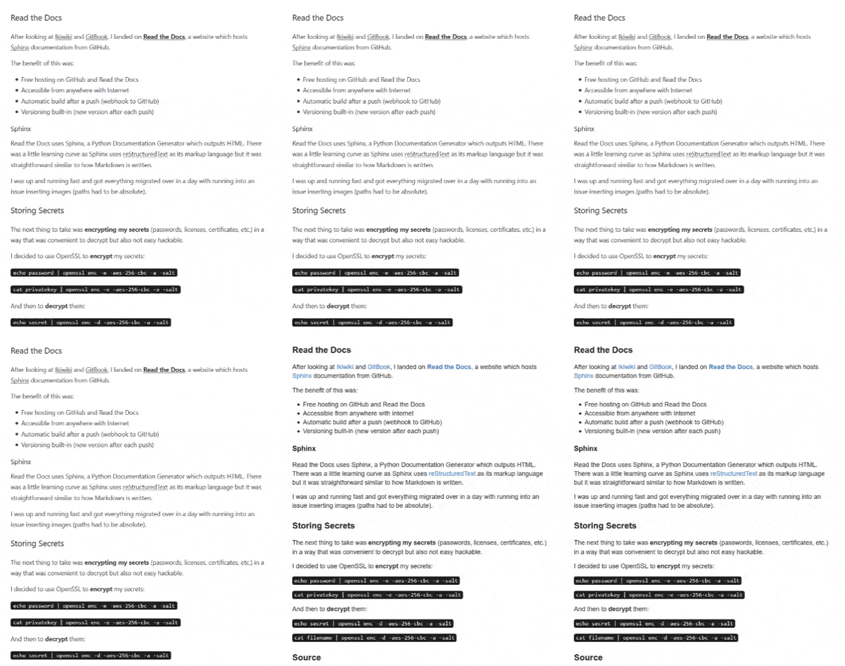
Here are the subtle differences you can find:
- Fonts changed to Calibre
- Headings aren't as bold and weighty
- A touch of red on all links, with transitions!
- The ugly 'READ MORE >>' button is gone
- Line spacing increased
Here's the difference on the homepage. It's more welcoming and not in-your-face as before.

Here's the difference when on a post. The headings aren't as bold but you can still pick out sections from the improved line spacing.
